- Pylab via Ipython
- The R Statistical Computing Environment and
- QtiPlot

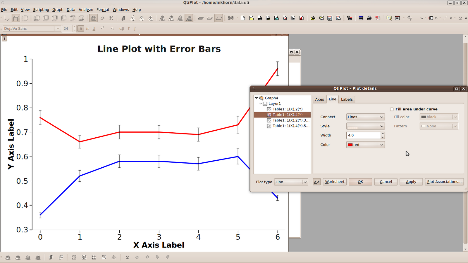
In the sample dataset above, I've included an "X Axis" column composed of 7 integers simply called X. I've also included two Y columns of means and two columns containing the Standard Errors of the datasets from which those means came. My plotting aim was to create a plot containing two lines describing the two Y columns and error bars matching the values from the two Standard Error columns.
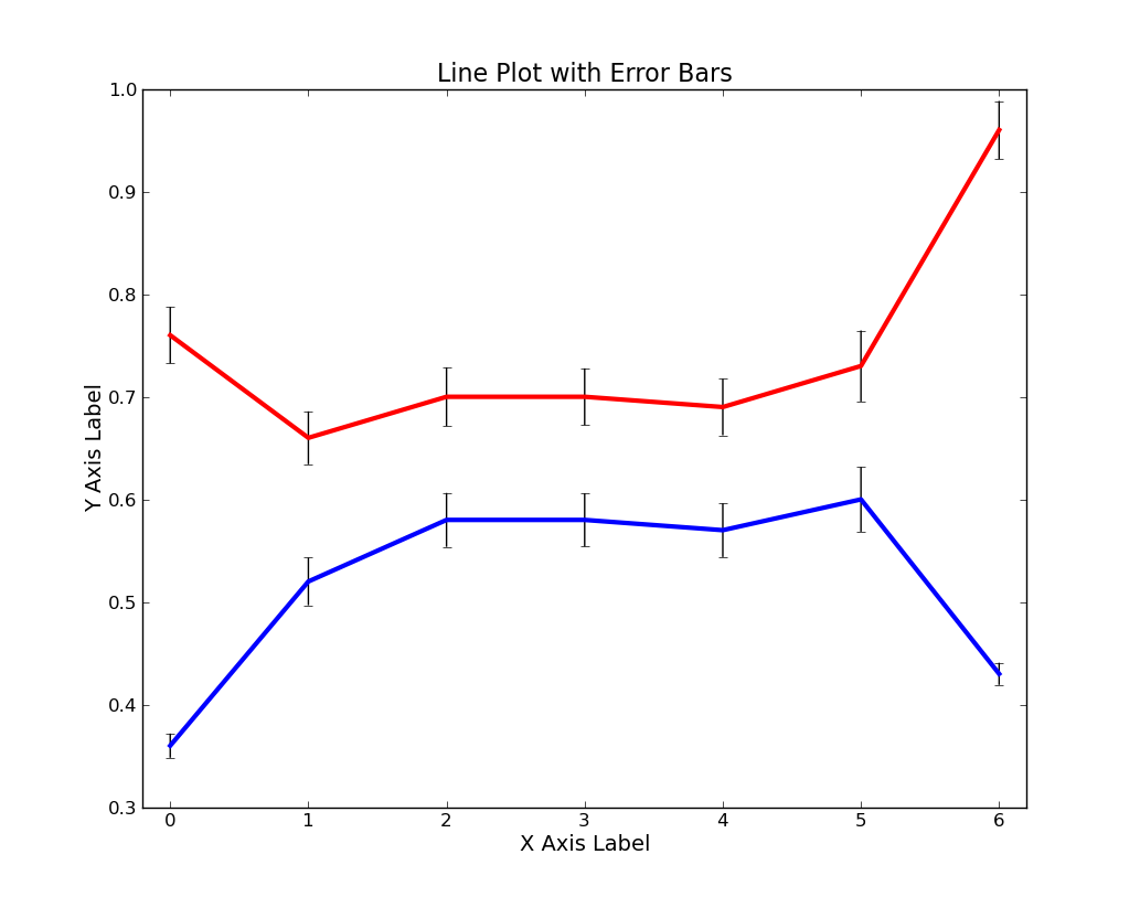


As you can see from the above plots, no one of these three software packages produces a bad looking plot. Some of the graphical parameters (such as font size, type of major axis ticks, whether or not a full box is drawn around the plotting area, and how far the plot title is from the top of the plotting area) are different from program to program, but that's more a matter of my unwillingness to get the programs to output exactly similar graphs than an inability in the programs themselves.
First and foremost is the fact that Pylab and R require you to type in some code to do your plotting whereas QtiPlot gives you a point-and-click GUI interface to complete the task. Pylab and R have their own idiosyncratic syntax for plotting, but thankfully neither requires much more code than the other. If you didn't know already, Pylab is a module of python and therefore allows you to seamlessly weave plotting commands into pure python code. It will therefore be advantageous for anyone who already has a Python background to use Pylab. Below I will show you the code I used to make the plots.
Pylab via IPython
- infile = open('/home/inkhorn/Documents/data.csv','rb')
- data = loadtxt(infile, delimiter=',')
- errorbar(data[:,0], data[:,1], yerr=data[:,2],color='b',ecolor='k',elinewidth=1,linewidth=3);
- errorbar(data[:,0], data[:,3], yerr=data[:,4],color='r',ecolor='k',elinewidth=1,linewidth=3);
- axis([-0.2, 6.2, .3, 1.0]);
- xlabel('X Axis Label', fontsize=14);
- ylabel('Y Axis Label',fontsize=14);
- title('Line Plot with Error Bars',fontsize=16);
R
- error.bar <- function(x, y, upper, lower=upper, length=0.1,...){ if(length(x) != length(y) | length(y) !=length(lower) | length(lower) != length(upper)) { stop("vectors are not the same length")} else { arrows(x,y+upper, x, y-lower, angle=90, code=3, length=length, ...)} }
- data = read.csv('/home/inkhorn/Documents/data.csv')
- png('/home/inkhorn/Desktop/test.png', height=1033, width=813, type=c("cairo"))
- plot(data$y2 ~ data$x, type="l",col='red',lwd=4,ylim=c(.3,1),main='Line Plot with Error Bars', xlab="X Axis Label", ylab="Y Axis Label")
- par(new=TRUE)
- plot(data$y1 ~ data$x, type='l', col='blue', lwd=4, axes=FALSE,ylim=c(.3,1),ann=FALSE)
- error.bar(data$x, data$y1, data$y1err)
- error.bar(data$x, data$y2, data$y2err)
- dev.off()
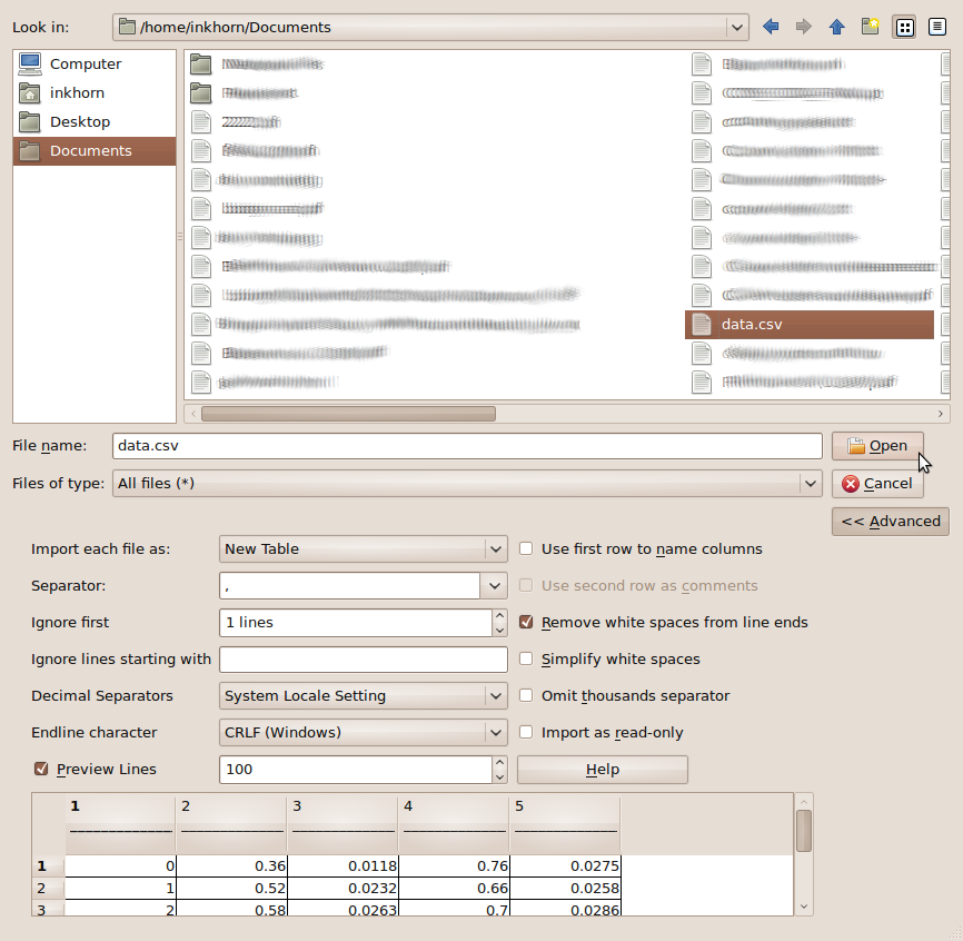
You then choose your data to import, specify the separator, whether or not you want to ignore lines at the top, then press OK.
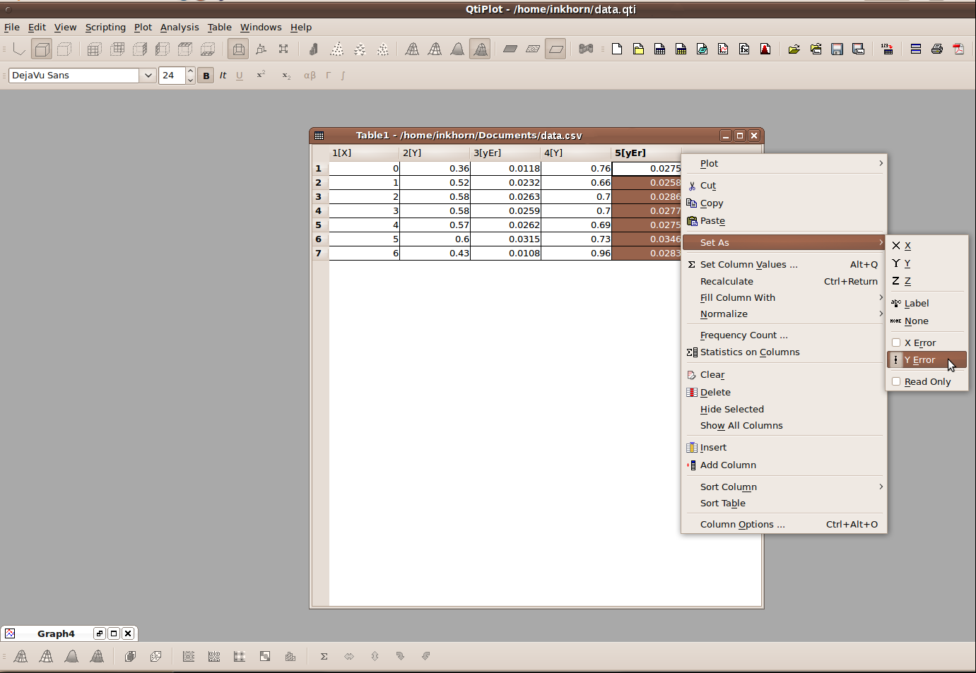
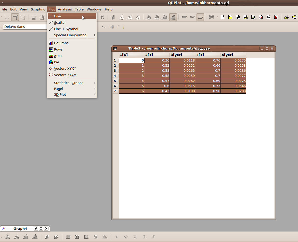
You are then shown your data in a Table view and must now right click on the columns and set their roles as shown above. As you can see, your columns can represent X variables, Y variables, Y error variables, even 3rd dimension, or Z variables. When you're done setting your column roles, navigate to the Plot menu and click on Line, as shown below.
A line plot will then be generated, using default values that you can change to your heart's content. The plot title and axis titles are very easy to change; all you have to do is double click on them and edit the default text that is already there. If you want to change any other aspect of the graph, it suffices to right-click on that part of the graph, and then click on Properties, such as what I did below with one of the lines on the graph.
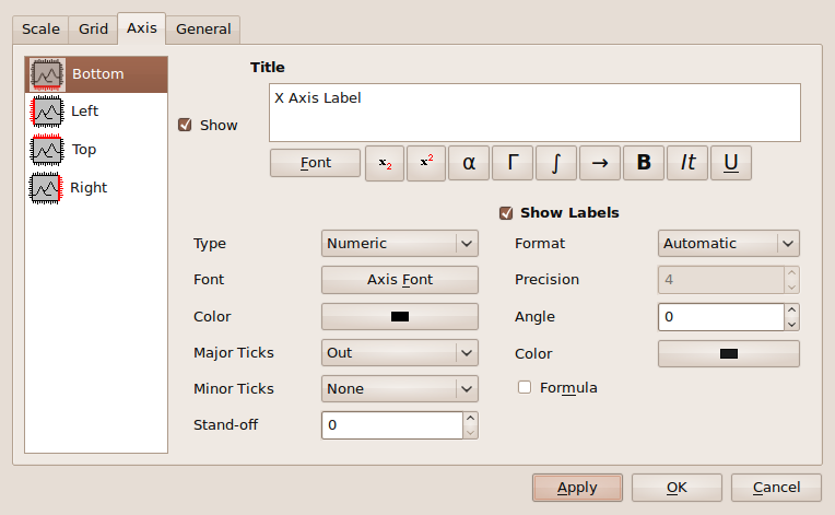
You can also modify how you want each of your axes to look by right clicking on the numbers of that axis and again clicking Properties. You can then change some general graphical properties of each axis, or change the way that the axis is scaled.

R has amazingly expansive plotting capabilities and certainly does not lose points on graphical quality. As you can see however, its syntax can be difficult to manage. I've used R for making summary plots of data that I also had to statistically analyze. Therein lies the ultimate use of R; it provides a single integrated environment for the plotting and analyzing of many different types of data.
When it comes down to it, however, I am quite lazy. I only recently discovered QtiPlot, and I think it's great! According to the QtiPlot website, it even provides an interface that allows you to script QtiPlot operations using Python. I don't know anything about that interface just yet, but it makes me very impressed with the program overall. Given my laziness, the quality of the plots that come out of QtiPlot, and the ease with which you can manipulate them, QtiPlot rates very highly in my books. I will surely be using it more in the future for plotting where the data is easily accessible and will highly recommend it to others.


Qtiplot is great, but has a strange licence (open source, but licence fee ?). You could also check SciDAVIS (http://scidavis.sourceforge.net/index.html) a fork of QtiPlot.
ReplyDeletePylab and R would also compete with Scilab and Octave.
I've found MagicPlot recently. It's not open source, but it's free for non-commercial. Nonlinear curve fitting and multipeak fitting in MagicPlot are very useful.
ReplyDeleteQtiPlot es open-source, and you can download the source code for free. If you don't want to compile it yourself, you can buy a binaries package including support for about 20€ a year (the cheapest license).
ReplyDeleteHowever, please pay $20 at least once in your lifetime to help the developer.
ReplyDeleteThe qtiplot was sure done the hard way. Just copy the 5 columns of data into the data sheet. Mark the two error columns using I in the block X Y Z I at the top. Select all columns with your mouse. Last go to Plot and select line. Game over.
ReplyDelete